Ionata
Digital products supporting those who need them most
A clearer expression of
a growing digital agency
Ionata had grown beyond its beginnings as a small web studio. We helped bring its brand into step with the depth, purpose and complexity of its work.
A brand that needed
to catch up
As Ionata evolved into a multidisciplinary digital agency, its identity no longer clearly reflected the business it had become. Its work spanned sectors and disciplines, but the brand needed a more coherent way to communicate that breadth.
The challenge was to bring clarity to a complex practice while keeping the purpose of its work in view: digital products supporting those who need them most.
Clarity through strategy.
Consistency through design.
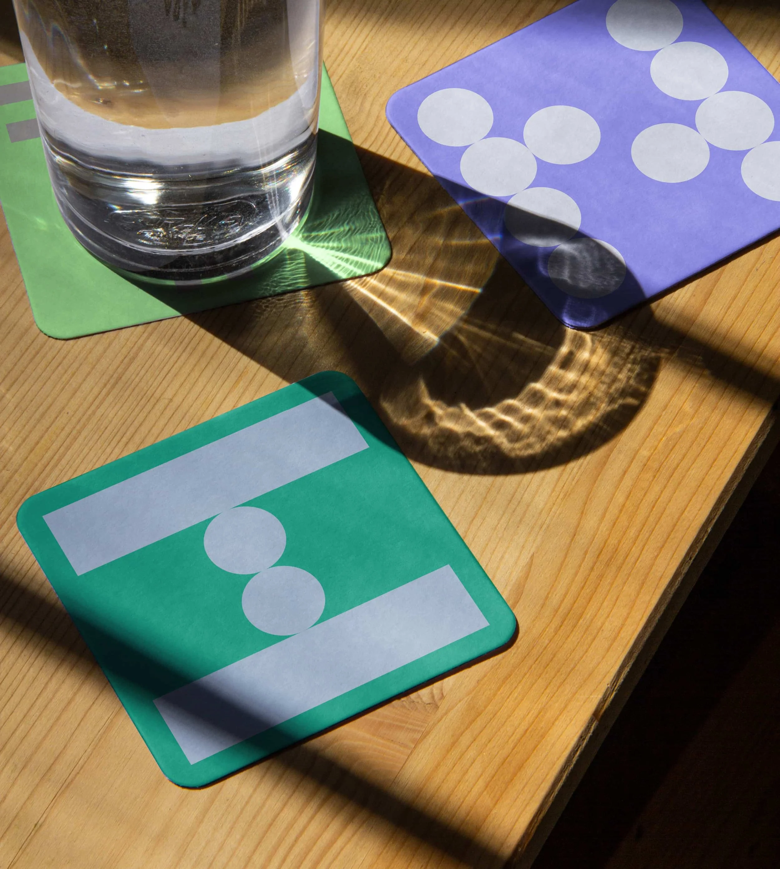
We redefined Ionata’s brand strategy and built a cohesive visual system around it. The aim was to make the agency’s work easier to understand and give it a consistent expression across different settings.
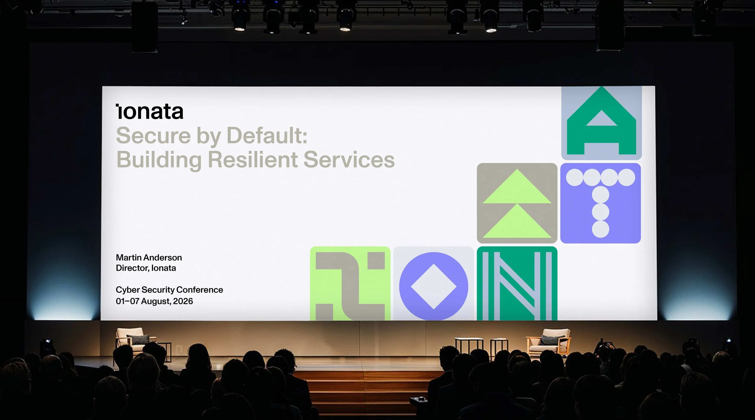
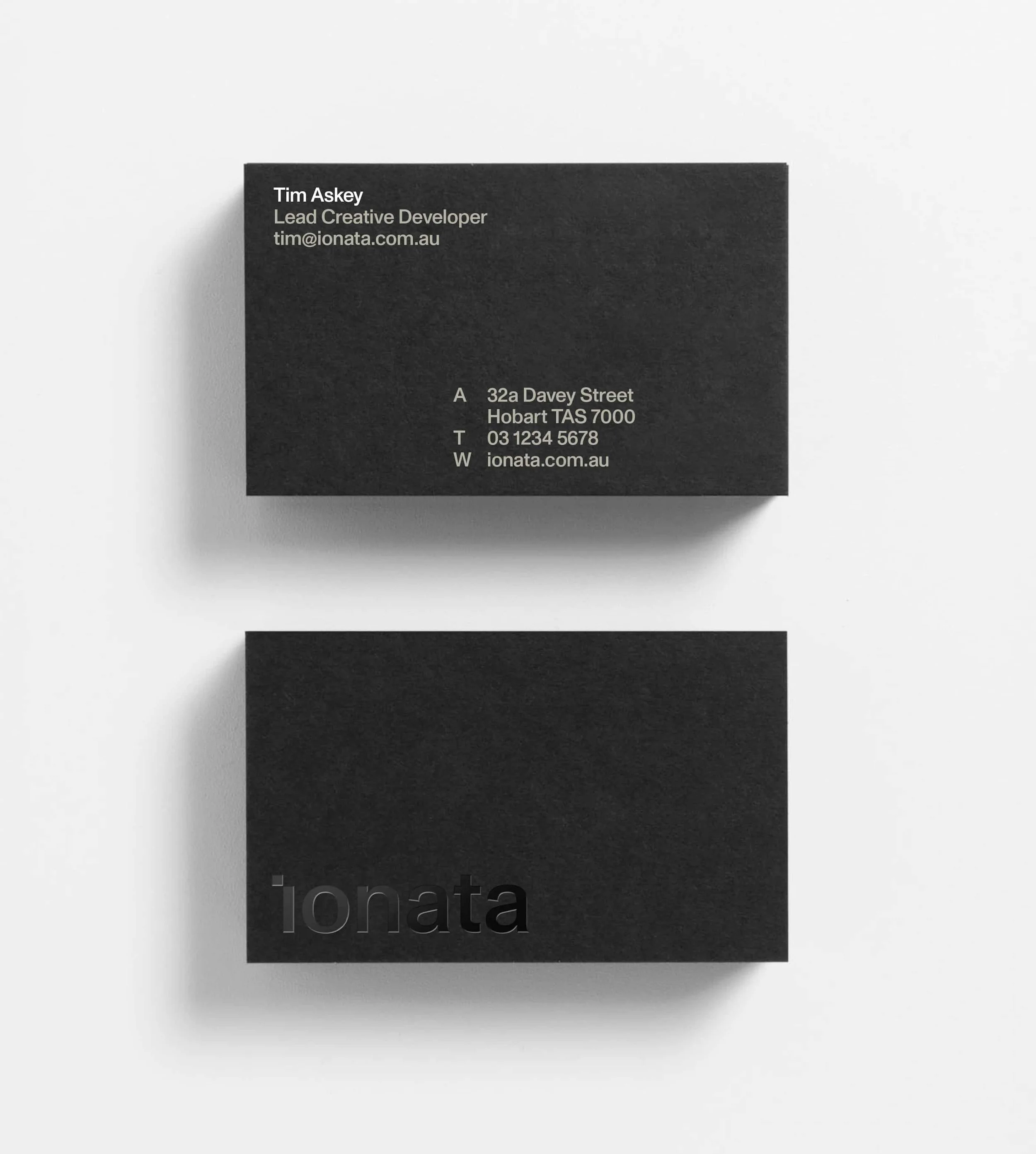
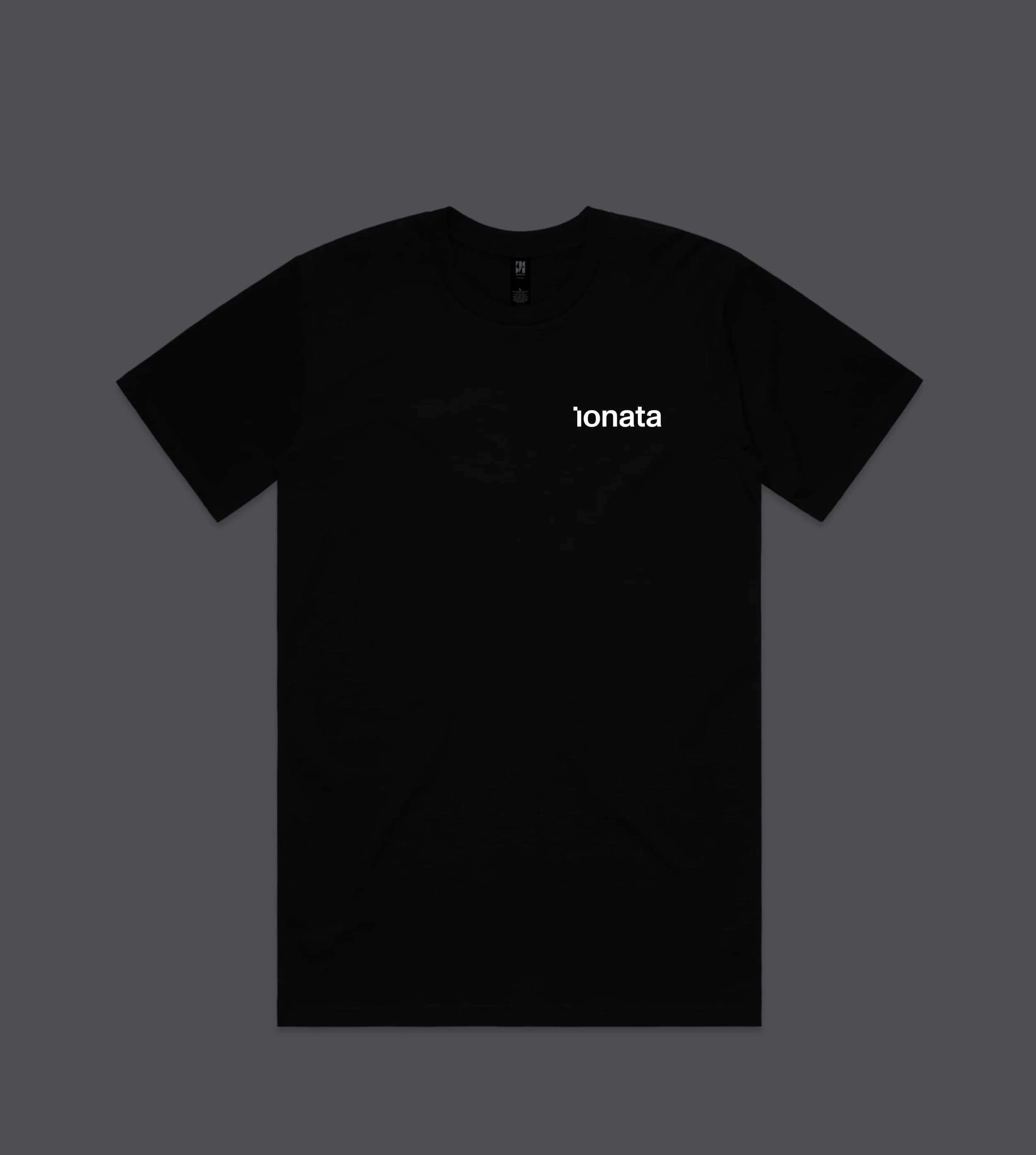
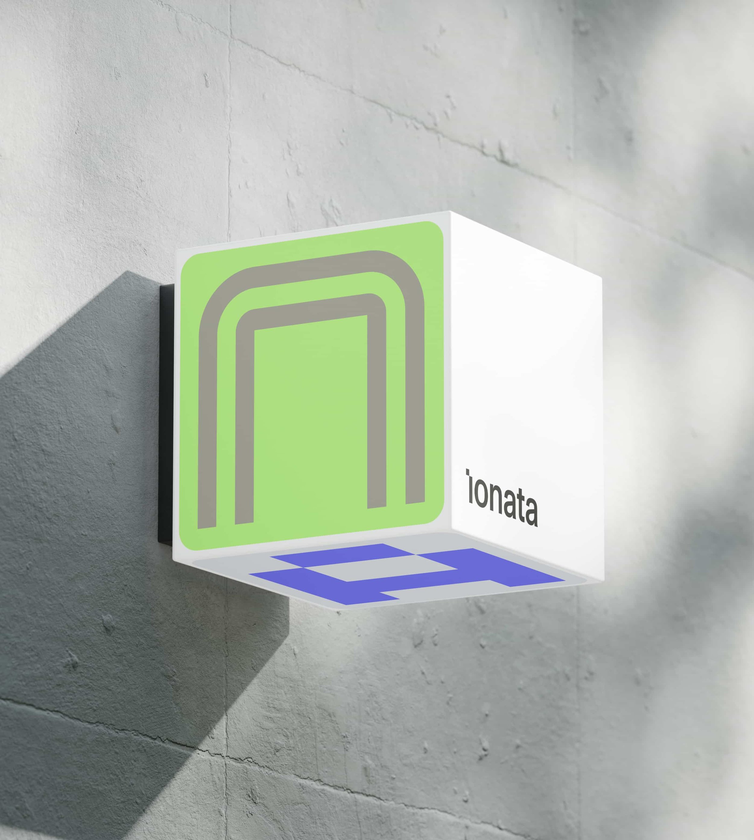
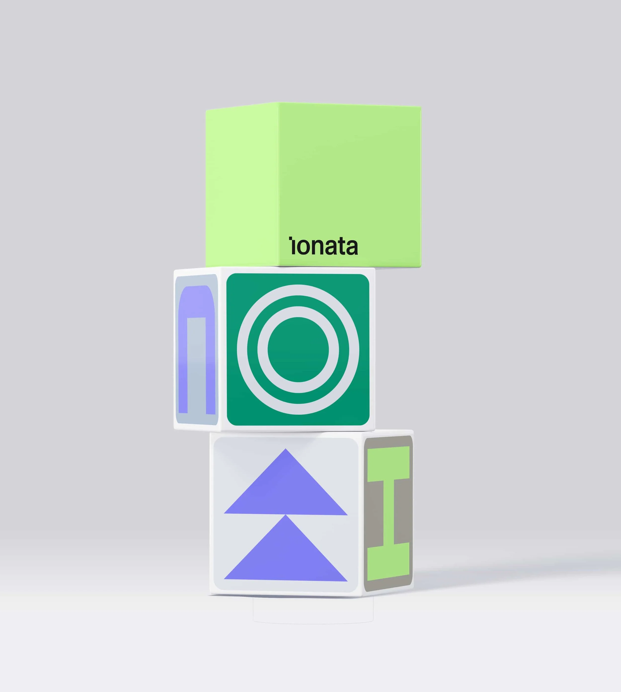
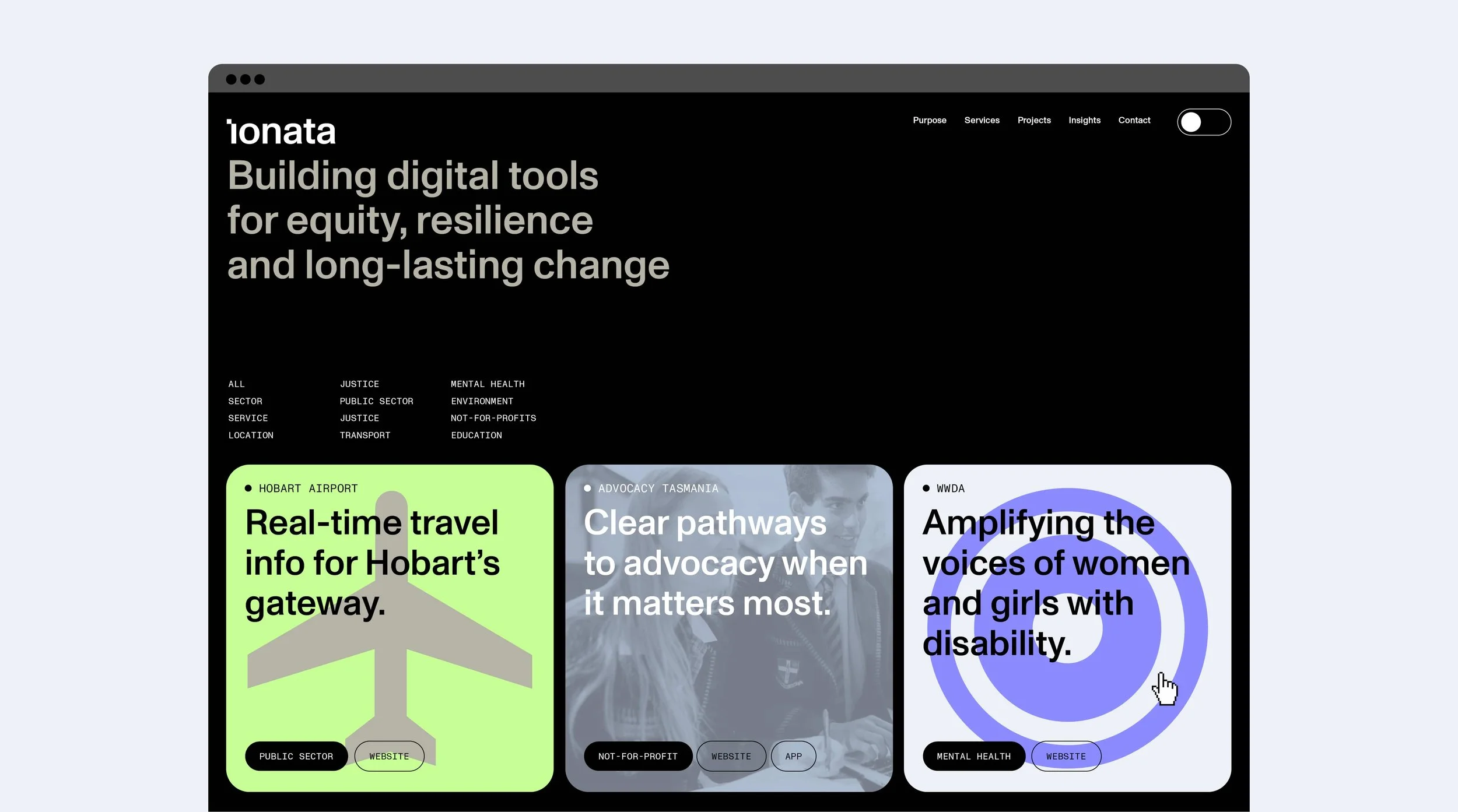
A restrained wordmark sits alongside a flexible family of geometric symbols. Green, lime and violet bring energy to a system that can move between direct communication and more expressive applications.

One identity.
Room to adapt.
The identity brings simplicity and consistency to a practice with many moving parts. Across the website design, printed materials and signage shown here, the same visual language gives Ionata a recognisable presence while allowing each application to do its job.
The result is a confident, flexible identity that reflects how Ionata solves problems, collaborates and delivers digital services that need to work in the real world.

MULCH TEAM
SAM MOFFAT
TOM WALKER